
💎 From Wall-of-Text to Visual Story with NotebookLM and Nano Banana Pro
How AI Is Collapsing the Translation Layer Between Thinking and Drawing

There’s a particular kind of frustration that strikes when someone asks you to “just put that in a diagram or a concept map.” You’ve done the thinking. You have a decent document, solid notes, maybe a tidy summary sitting in your knowledge stack. The ideas are there, coherent in your head, ready to be communicated.
Then you open Keynote. Or PowerPoint. Or Figma. Suddenly, you’re dragging rectangles around, hunting for arrow tools, Googling “nice timeline templates,” and wondering why you ever thought visual communication was within your grasp. The thinking was the easy part. The drawing is where everything falls apart.
Why it matters
Turning ideas into diagrams has always carried a hidden tax: you pay in design skills, time, or someone else’s calendar. That tax means most people stick to text and hope their readers will reconstruct the structure in their heads.
Now you can split the work. NotebookLM acts as a structure engine, proposing whether your idea wants to be a flow, a map, or a grid, and naming the key pieces. Nano Banana Pro acts as a rendering engine, turning that structure into a graphic with real labels and a layout that doesn’t scream “default template”.
Once diagrams are cheap, something shifts. They stop being decorations you add at the end and start becoming part of the thinking itself. You can argue with the structure while it’s still rough, redraw it three times in an afternoon, and keep the one that actually matches how your system works. One honest diagram then earns its keep across talks, posts, decks, and client work.
My “four thinkers, one hourglass” experiment
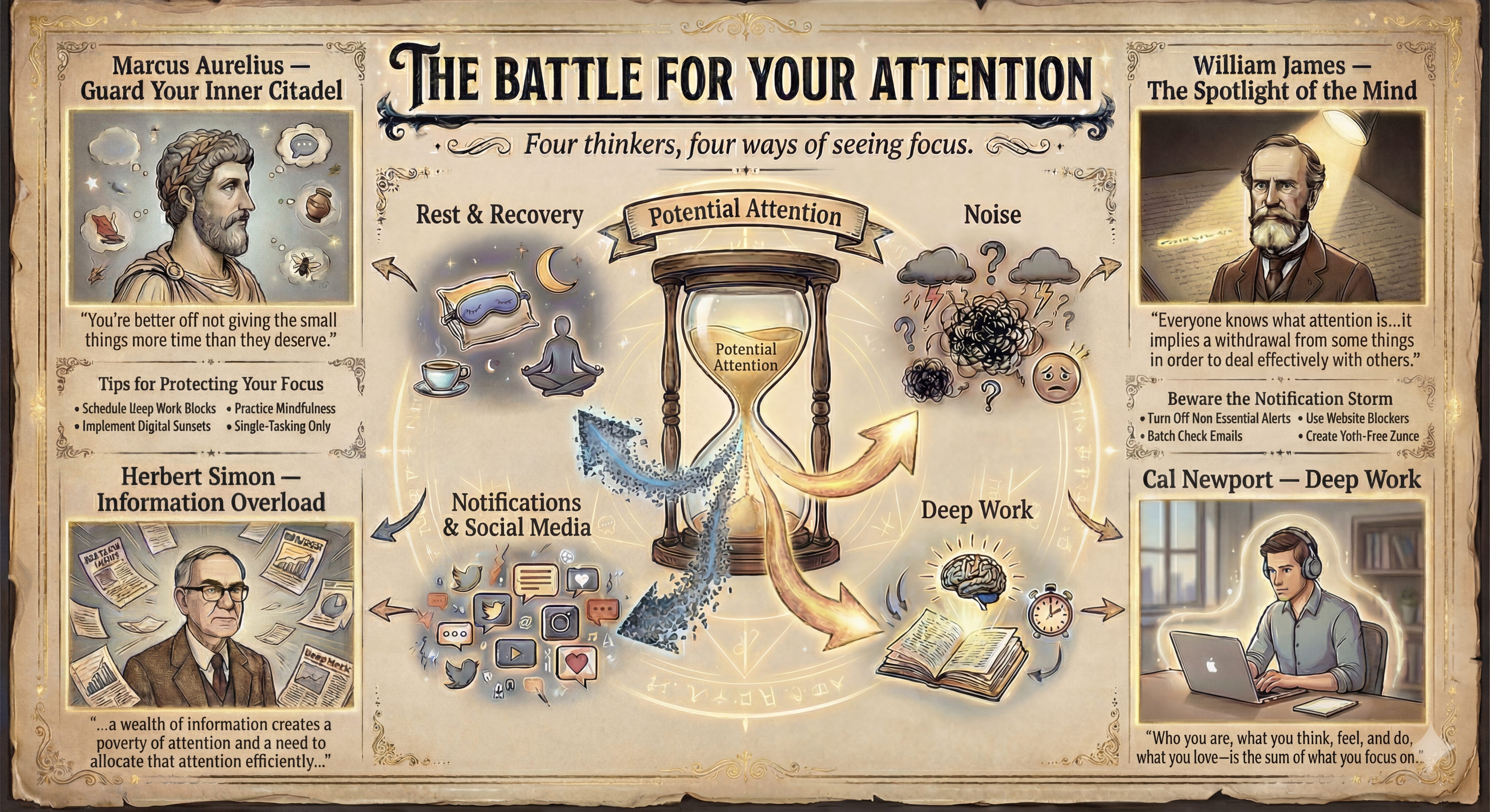
I tried this on a topic that normally hates diagrams: attention & focus. The thing all of us pretend we can manage with a new to‑do list. I took my own literature notes from four writers: Marcus Aurelius on guarding the inner citadel, Herbert Simon on information overload, William James on attention as a spotlight, and Cal Newport on deep work, and dropped them into one NotebookLM notebook.
Then I asked for three things: one sentence per thinker on what attention is, the main threat each one worries about, and a single visual metaphor that could hold all four.
NotebookLM proposed an hourglass labelled “Potential Attention” with four flows around it: notifications and social feeds leaking grains away, noise and mental clutter whipping up a storm, deep work channeling a focused stream into meaningful output, rest and recovery refilling the glass so tomorrow isn’t wrecked. That spec went straight into Nano Banana Pro with a simple art‑direction prompt. Two iterations later, I had an illustrated poster, “The Battle for Your Attention”, that I can now reuse in talks and newsletters, and tweak by editing the prompt instead of redrawing the scene from scratch.

The point isn’t that attention is special. The point is that the idea → structure → diagram loop now feels like a standard move, not a heroic effort. Yes, it saves time. That’s the boring part. The interesting part is what happens to your thinking when diagrams are cheap.
💎 A diagram forces you to pick a spine. Text lets you waffle. You can hedge, qualify, and layer so many clauses on top of each other that nobody can tell what depends on what. Once you try to draw it, you have to decide what sits at the center, what orbits, what flows, and what opposes. An AI that suggests a structure is, in effect, saying: “Here’s what your argument looks like if we take it seriously...”
Use this workflow when…
Use this workflow when you’re turning a dense research note or strategy doc into a one‑page visual. You’re comparing several options or frameworks that currently live as vague vibes in people’s heads. You’re building teaching material you’ll reuse: onboarding flows, core models, “the same explanation I always give clients.”
Skip it or keep it rough when you’re dealing with messy emotional topics that don’t belong in neat boxes, tiny one‑off decisions that fit on a whiteboard, or anything that needs real visual identity and should land on a designer’s desk. I don’t want to pretend the aesthetics are magical. The diagrams you get this way are competent, not iconic. You will sometimes see that slightly generic AI sheen. If you need something that belongs on a book cover, that’s still human work..
Try it now: one idea → one diagram loop
60 seconds — ask for the shape
Pick a real document: a research note, client summary, or draft article. Drop it into NotebookLM and ask:
“Assume this has to be explained with one diagram. What type fits best (timeline, flowchart, concept map, matrix, funnel), and what five to seven labeled elements should it contain?”
5 minutes — argue with the structure
Read the answer and fight with it a little. Rename elements. Merge two that are secretly the same. Split the one that’s doing too much work. Ask again until the structure on screen matches how the idea feels in your head.
15 minutes — hand it to Nano Banana
Ask NotebookLM to turn the final structure into an image spec: diagram type, element names, relationships, and a few suggested icons or metaphors. Paste that into Nano Banana Pro, add simple style constraints (“16:9, high contrast, clear labels, no more than three colors”), and expect to bin the first image and keep the second or third. Save the best version into a “visual library” folder you’ll actually open again.
Next time someone says, “Can you put that in a diagram?”, don’t sigh and reach for the shape tool. Run the loop instead: idea → NotebookLM structure → Nano Banana diagram. The tools will handle the boxes and arrows happily. Your job is the part that still requires a human: deciding what actually belongs at the center, what orbits around it, and whether the arrows you’re drawing reflect how things really flow (or just how you wish they did).
PS: I’m still not sure what we lose when visualization becomes this cheap. Part of the value of hand-drawing diagrams is that you have to really understand the structure to build it yourself, piece by piece. When you outsource that to a model, you might get a plausible-looking diagram that’s structurally wrong, and miss it because you never did the slow construction work. For now, I’m treating these as drafts for thinking, not finished artifacts.
Topics: Productivity, Automation, and AI
Tools: